Components
Scope
There are…
- components that come included with interkit
- custom components you build for your project
Blockly
Components are arranged via Blockly.
The blocklyState.json gets translated into an App.svelte.
Both files are equivalent to the blockly representation you see in the component editor.
Component Files
Each component consists of two files:
ComponentName.svelte- a svelte componentComponentName.yaml- definitions for the component editor
Documentation
- add a doc entry at
content/components/ComponentName.md - add a preview image
(shown in the component picker inside the authoring system)
to the docs repository at
static/images/component_previews/ComponentName.png
Dummy Data
For components that use data from sheets, it is useful to define some dummy data to make it easier to see how the component looks even without data. In the preview pane you can toggle Dummy Data on and off.
In your component code, add the following to get a reactive store with the boolean representation of the toggle.
import { getShowDummyDataStore } from './dummyDataHelpers.js'
const showDummyData = getShowDummyDataStore()
Example
You can find this example for a custom project component in
src/components/ProjectComponentExample.svelte
ProjectComponentExample.svelte
see source code
<script>
  export let text = "override this example text in blockly!"
  // preset option value should match the first option in yaml
  export let options = "red"
</script>

<p style="--color: {options}">
  {text}
</p>

<slot></slot>

<style>
  p {
    background-color: var(--color);
  }
</style>
ProjectComponentExample.yaml
see source code
name: ProjectComponentExample
title: ProjectComponentExample
colour: 100
fields:
  - type: string
    name: text
  - type: options
    name: options
    options:
      # first option should match the preset value in svelte
      - red
      - yellow
  - type: slot
    name: default
toolboxCategory: Project
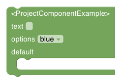
Resulting ProjectComponentExample in component editor
Reactive Data Loading example
This example components loads data from a sheet that has the key “sessions” reactivly – showing updates in real time.
see source code
  <script>
    import {onMount} from 'svelte'
    import { InterkitClient } from "interkit"

    let rowsStore
    let sessions = []

    onMount( async ()=>{
      // get reactive store for the rows of the sheet "sessions"
      rowsStore = await InterkitClient.getRowSubStore("sessions")
    })

    $: {
      if (rowsStore) {
        // sort the sessions by start_date
        sessions = $rowsStore.sort((b, a) => a.values.start_date - b.values.start_date)
      }
    }

  </script>

  <h1>List of sessions</h1>
  {#each sessions as session}
    <p>{session.values.title}</p>
  {/each}
List of supported attributes in .yaml
namename of the filetitletitle for the editorcoloura number, see Blockly colour pickertoolboxCategorycategory for the editorslotCategory(optional) name that corresponds to allowedChildren (it will only fit when mentioned there)fields(optional) array of fieldsnamename of the fielddefaultValue(optional) default value for the fieldtypetype of the field (type see below)
docsPath(optional) a path to the documentation for this block, if not set, will use the name of the component
field types
stringnumbercheckboxoptionssheetColumnslotextraProps
additional attributes for field type: options
options
additional attributes for field type: slot
slotPropsallowedChildren
additional attributes for field type: sheetColumn
A sheetColumn field offers the user a helper for the automatic creation of the column in the database if not found. To use this, you need to specify the type of the column to create in the database.
columnType- “string” | “location” | “sheetRef” | “date” | “mediaFile” | “number” | “optionSelect” | “richText”options- for columns of type “optionSelect” specify available options with a string like “option1, option2, option3”
using extraProps
Add a field with type extraProps to move component settings into a modal.
List the fields (including type, name, defaultValue) in the props attribute.
Documentation
You can add a help attribute to fields and extraProps fields.
The extraProps help is displayed in the modal.
All help is displayed when you use the ComponentInfoYaml component
on a documentation page for the component.