Displaying multiple elements
These components allow you to display multiple rows from the database in different ways.
In order for them to display data, they need to be children of a DataLoaderMulti oder a DataRouteMulti.
DataList
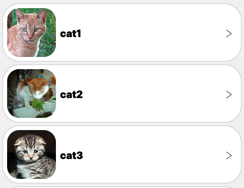
Show data elements as a list. Use ScrollContainer to add scrolling. Commonly used in conjunction with a DataCard.
Developer docs
Slots
| Name | Default | Props | Fallback |
|---|---|---|---|
| dataElement | No | ||
| emptyElement | No |
DataCarousel
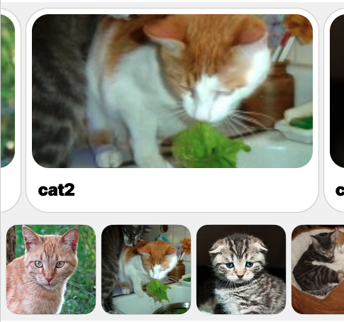
Show data elements as a carousel that you can slide left and right. Commonly used in conjunction with a DataCard.
Developer docs
Props
| Prop | Type | Default | Description |
|---|---|---|---|
| gaps* | |||
| background* | |||
| roundedCorners* | |||
| mode* |
Slots
| Name | Default | Props | Fallback |
|---|---|---|---|
| contentElement | No | ||
| emptyElement | No |
PictureBook

Shows images that you can swipe left and right. When an image is swiped, the component provides the data of the selected element to its “contentElement” slot, where you can show additional info, for example using a DataCell.
Developer docs
Props
| Prop | Type | Default | Description |
|---|---|---|---|
| orderColumn* | |||
| imageColumn* |
Slots
| Name | Default | Props | Fallback |
|---|---|---|---|
| contentElement | No |
Mosaic
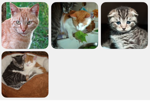
Displays a mosaic of images in three columns. Intended to be used with DataTile.
Developer docs
Props
| Prop | Type | Default | Description |
|---|---|---|---|
| gap | boolean |
true |
Slots
| Name | Default | Props | Fallback |
|---|---|---|---|
| contentElement | No | ||
| emptyElement | No |