Button
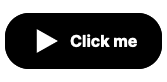
Basic button to allow user input.
Your app can respond to a button press in several different ways by setting it’s effect, for example activating a specific Route.
Live Examples
Large Button
Medium Button
Small Button
Figma
Developer docs
Props
| Prop | Type | Default | Description |
|---|---|---|---|
| effect* | |||
| ariaLabel* | |||
| flex | string |
"normal" |
|
| size | string |
"medium" |
|
| type | string |
"secondary" |
|
| text* | |||
| mainClass | string |
'' |
|
| buttonOptions | {} |
{} |
|
| height | string |
"fixed" |
|
| disabled | boolean |
false |
|
| selected | boolean |
false |
|
| dummyNoText | boolean |
false |
Slots
| Name | Default | Props | Fallback |
|---|---|---|---|
| Yes |
Events
| Name | Type | Detail |
|---|---|---|
| click | forwarded |
ButtonBar
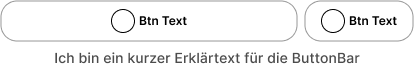
Use the ButtonBar to organize Buttons horizontically, for example by centering a button or allowing buttons to fill the full width of the bar. You can also add a help text below the bar.