Loading Data
In this tutorial, you will first learn how to load data from individual database rows and cells, and then how to load multiple rows to display them as lists, carousels or markers on a map.
Preparation
We assume you’ve had a look at the Hello World tutorial. Also have a look at the quick start guide Working with Data before continuing here.
Create a new empty project or continue with the project you created during the hello world tutorial. You can remove all components except for AppBase.
Loading individual rows and cells
Setting up a database sheet
Begin by setting up a database sheet for your project. Go to the “Data” section using the main tab navigation at the top, then click on the Create Sheet button and give your sheet a name, for example “elements”.
Click on the ⋮ menu in the table header and add a database column, you can call it “content” and select RichText as type.
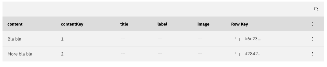
Now we’re ready to add some content! Click the Add Row button and click on the cell in the content column to add some text. Press Save to submit your changes to the database. Add a second row with some more text.
Your sheet should look similar to this:
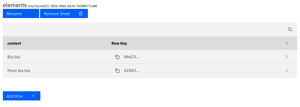
Tip: RichText columns can contain long text that is formatted with markdown.
Loading a single cell
The data you store in your database sheet needs to be loaded with special components to appear in your app. Head over to the App tab to set this up.
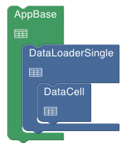
We’ll first load just a single cell from your database. From the Data section in the component library on the left, drag in a DataLoaderSingle and a DataCell component and combine them like this:
In order for the data to load, you need to tell the DataLoaderSingle to load a specific row in a specific sheet. And the DataCell component needs to know which column to look in.
The simplest way to configure DataLoaderSingle to load a specific row is to give it a Row Key. Row Keys are unique identifiers for each row in a sheet.
Head back over to the Data section and copy the Row Key of one of your rows to the clipboard by clicking on the little copy buttons.
Open the settings menu of the DataLoaderSingle component on your App canvas and paste the Row Key in the rowKey field. You also need to select the sheet where the key is from. Now open the settings menu of the DataCell component and select the sheet and the column that you want the component to show.
Save both changes to the component settings, and your content should be shown on in the preview.
Note: Once you have set up database connection in this way, all changes you make in your database will immedeately be visible in your app. Try it by editing the content in the database cell that you are using here and observing how it changes in the app preview.
Using a custom key column
In some cases it can be cumbersome, intransparent or inflexible to copy individual row keys into DataLoaderSingle. You can also use a custom key column on the sheet to identify rows in a human readible way.
To set this up, creat a new column named “ContentKey” with type String in your sheet. Now add a unique identifier like “text1”, “text2” to each row. You can now configure your custom key column in DataLoaderSingle and use “text1” instead of the built in row keys.
Just show me the result
If you just want to see this step of the tutorial without building a new project, you can open the project template included with interkit.
Loading multiple rows
Often, you want to load multiple rows of data to display them as a list, a carousel or as markers on a map.
Creating a list
Let’s change the project you have made so far to display content not from a single row, but from a list of all the rows in your sheet.
Start by adding DataLoaderMulti and DataList to the canvas. Just place them below DataLoaderSingle inside AppBase for now. Drag your DataCell component from the DataLoaderSingle to the dataElement slot of the DataList component.
Save your changes. Your component canvas and preview should now look like this:
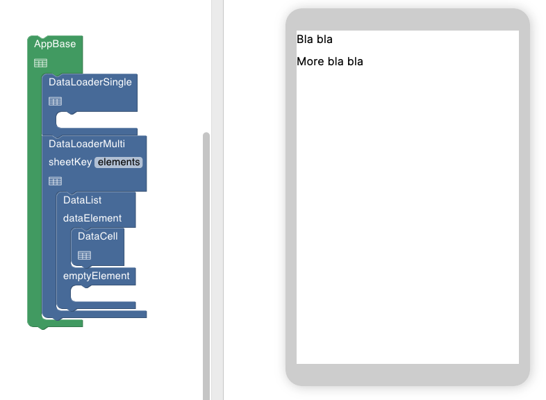
As you can see, instead of displaying the contents of only one cell in a single row, DataLoaderMulti now loads all the rows, and DataList displays them one below the other. You can go ahead and delete DataLoaderSingle as it’s not needed anymore (right-click on the component and selecting Delete).
Using cards
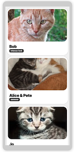
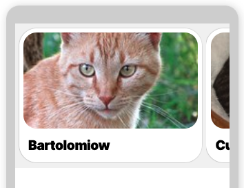
Showing a bunch of different rich text cells as a list is not a very common use case (you could after all just put the list in one cell). A much more frequent need is to display a list of structured data, containing for example a title, a label and an image:
To eachieve this, we can use a very versatile component included with interkit: DataCard. DataCard combines data from different columns (e.g. title, label, image) of a single row.
Let’s add some more columns to our sheet to try this out. Add two columns of type String for title and label, and one column of type MediaFile for an image. Your sheet should now look something like this:
Fill in some content for the titles and labels. To add images, upload them first in the Media tab. You can then select them when you click in the individual MediaFile cells in your sheet.
Now you can drag in a DataCard component and place it inside the DataList. In the DataCard component’s settings, you’ll have to select which columns in your database should be used to fill in the different parts of the card, e.g. title, labels, image.
Your component canvas should look something like this:
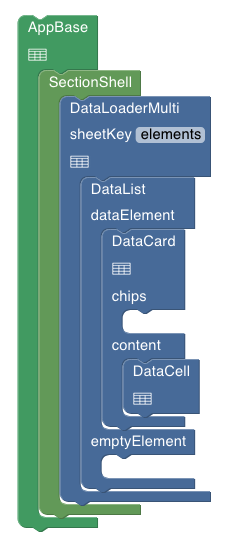
We’ve added a SectionShell to provide the gray background that looks good as a backdrop for the cards. Keeping the DataCell in the content slot of the DataCard is optional. This is a useful pattern for adding rich text content to cards.
Well done! Now you know how to load multiple rows of structured data and display it as a list of nicely formatted cards.
Just show me the result
Here’s a template project that demonstrates this.
Replacing the list with a carousel
Instead of showing cards vertically, you can show them horizontally as a carousel. Replace the DataList component with DataCarousel component to achieve this.
Here’s a template with a carousel instead of a list.
Showing data as markers on a map
Finally, with what you have learned now it is not a big leap to display data as markers on a map.
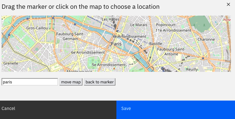
First, add a new column to your database sheet, and select the type Location. When you click on cells in columns of this type, you’ll be able to select locations from a map. Use the search field at the bottom of the modal to move the map to specific adresses.
Now you can drag th MapSimple component from the map section in the component library onto the canvas, and replace the DataCarousel with it. You components should look like this:
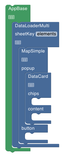
In the MapSimple settings, select the column you just set up for your locations as markerPositionsColumn.
There are many more options for working with maps. Have a look at the MapSimple component reference.
Just show me the result
Here’s a project template with a map:
Congratulations
Good job making it this far, we covered a lot of ground. In this tutorial, you learned how to load data from individual database rows and cells, and then how to load multiple rows to display them as lists or carousels of cards. Finally, you learned how to load data and display it as markers on a map.
The next tutorial covers Routing, and is the last tutorial in the foundation series.